banco
healthy fast food
Rebranding of a Healthy Fast Food in Rome
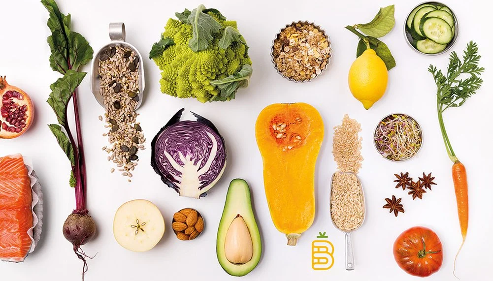
Banco is a natural fast food restaurant on Via Ostiense in Rome, serving fast food, but made with fresh, honest ingredients.
The project began with competitor research, to have a deep understanding on how other fast food and healthy food places in the market present themselves and where Banco could stand out. From there we defined a new brand approach: a place that takes its ingredients seriously but speaks to its customers with humour.
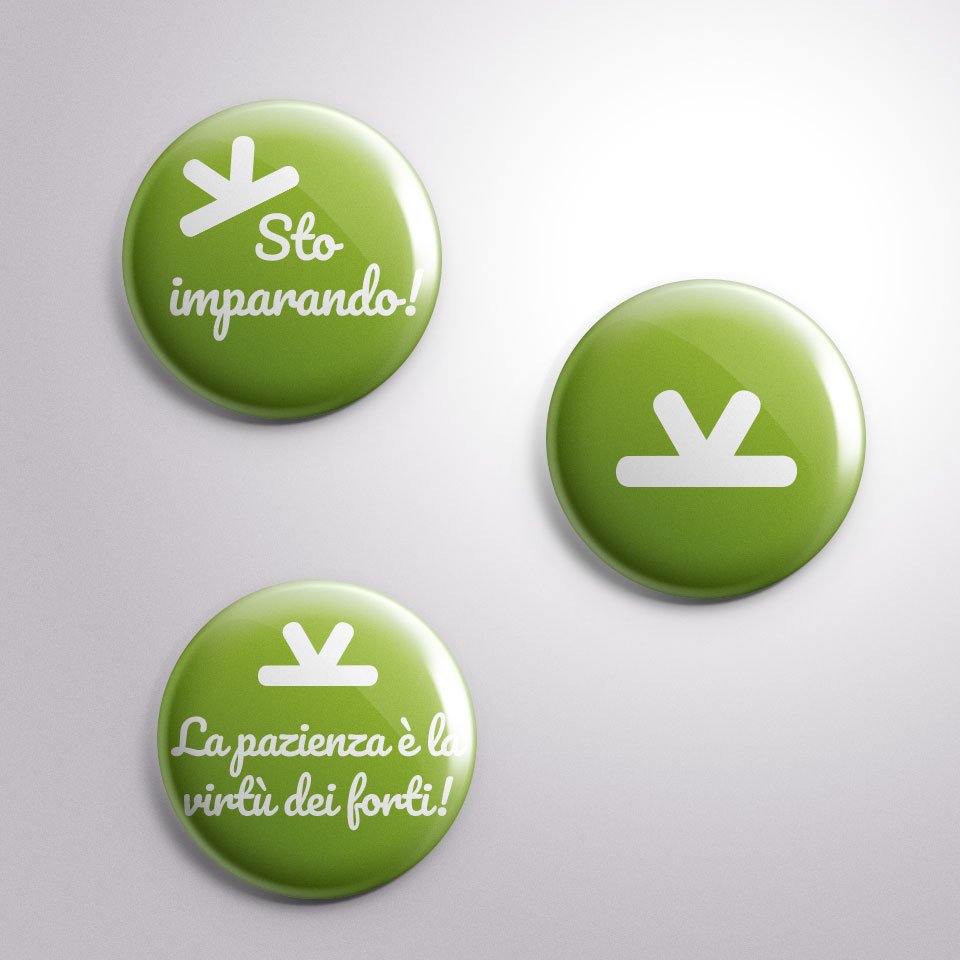
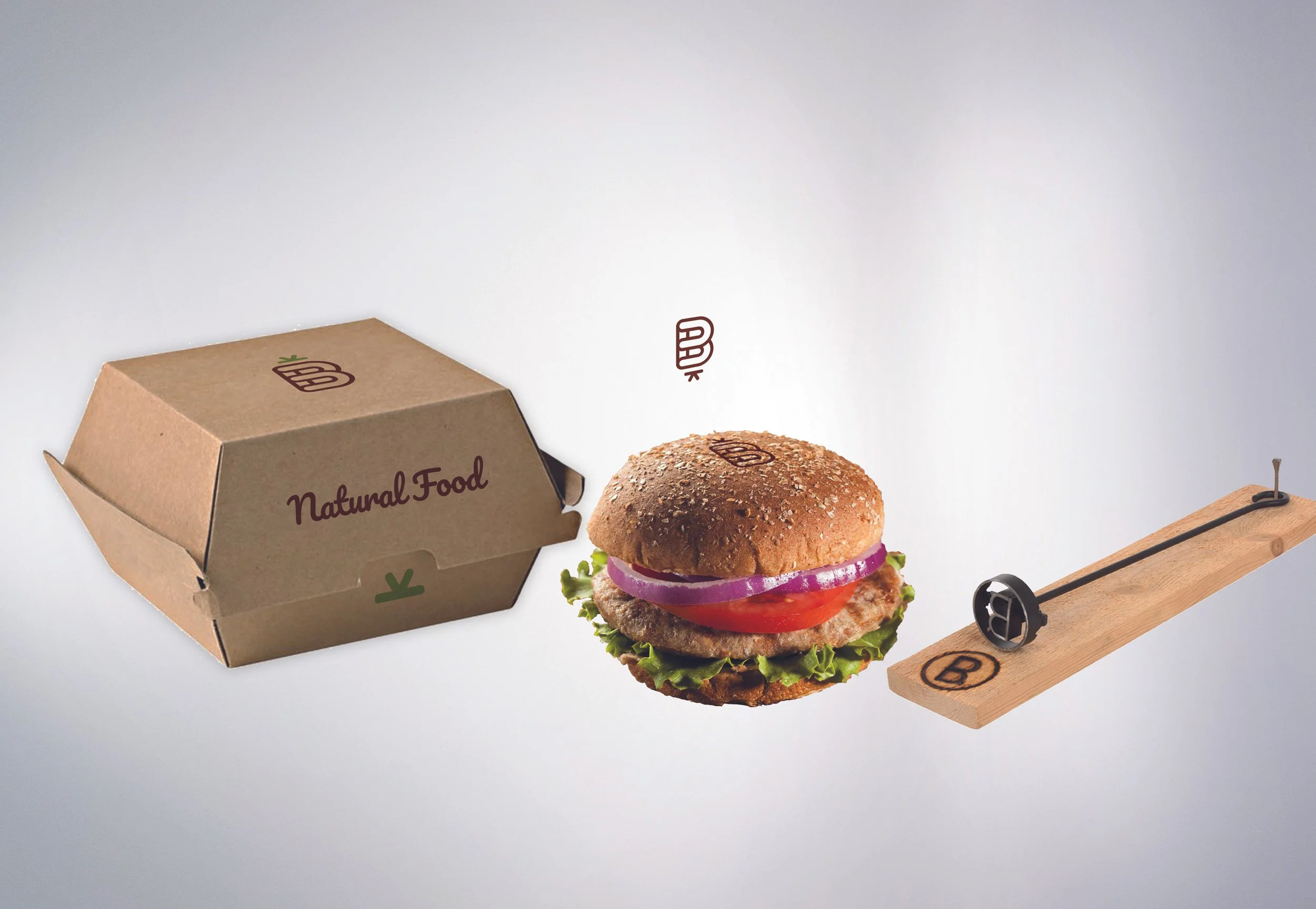
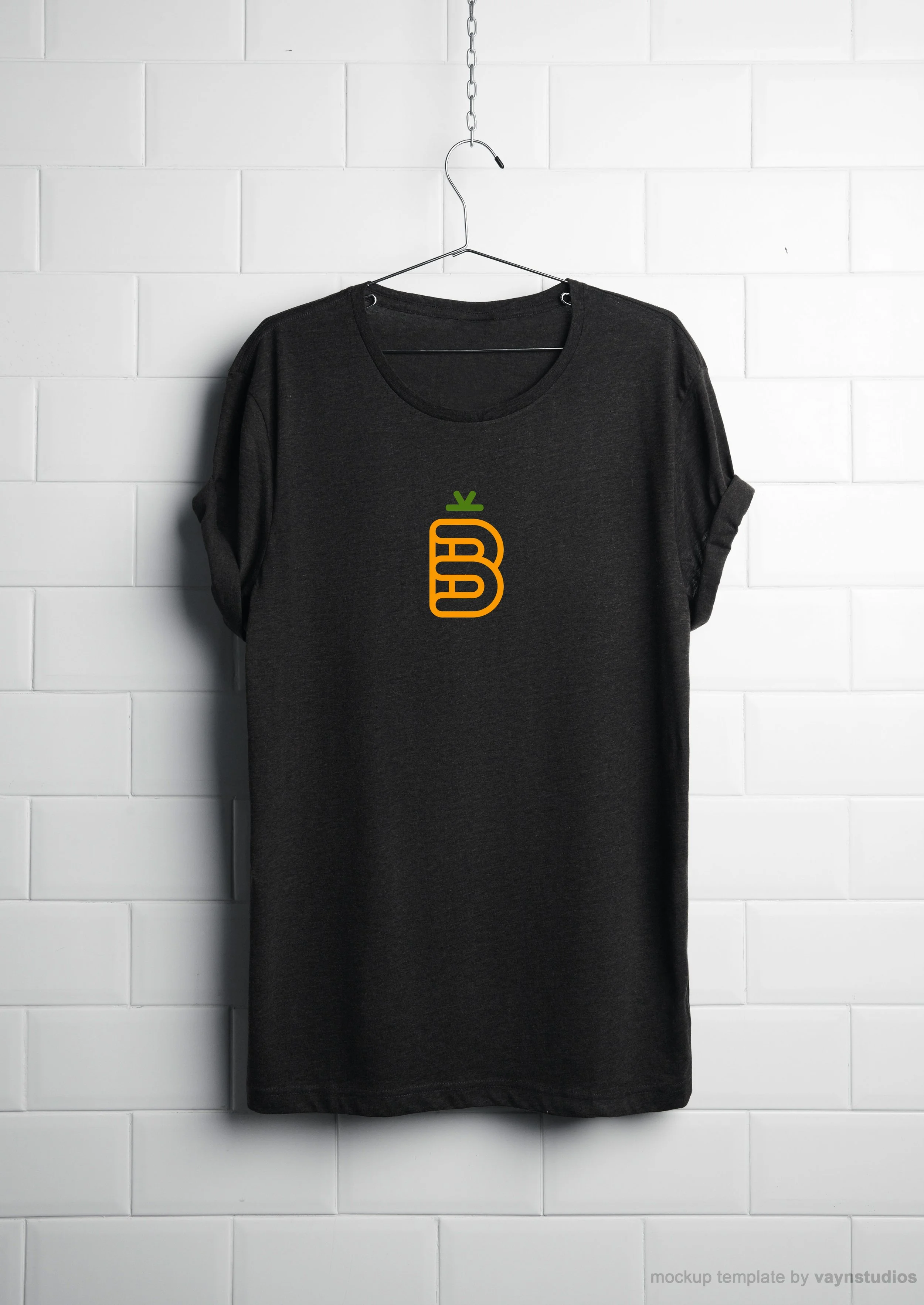
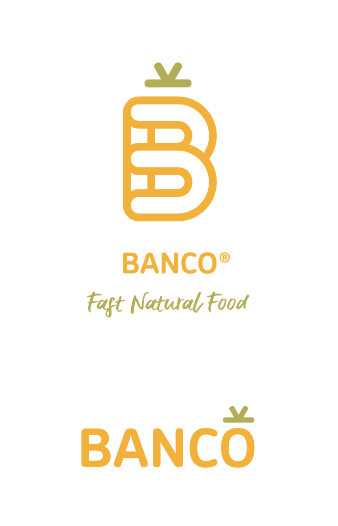
The agency didnt’ want to change the look completely, but wanted to give it a twist. That’s why I decided to put a green-hat on the top of the letter B. Browsing amongst the main font glyphs I worked on the asterisk, shaping it as a top sprout on the logo.

The tone of voice is a strong part of the identity.
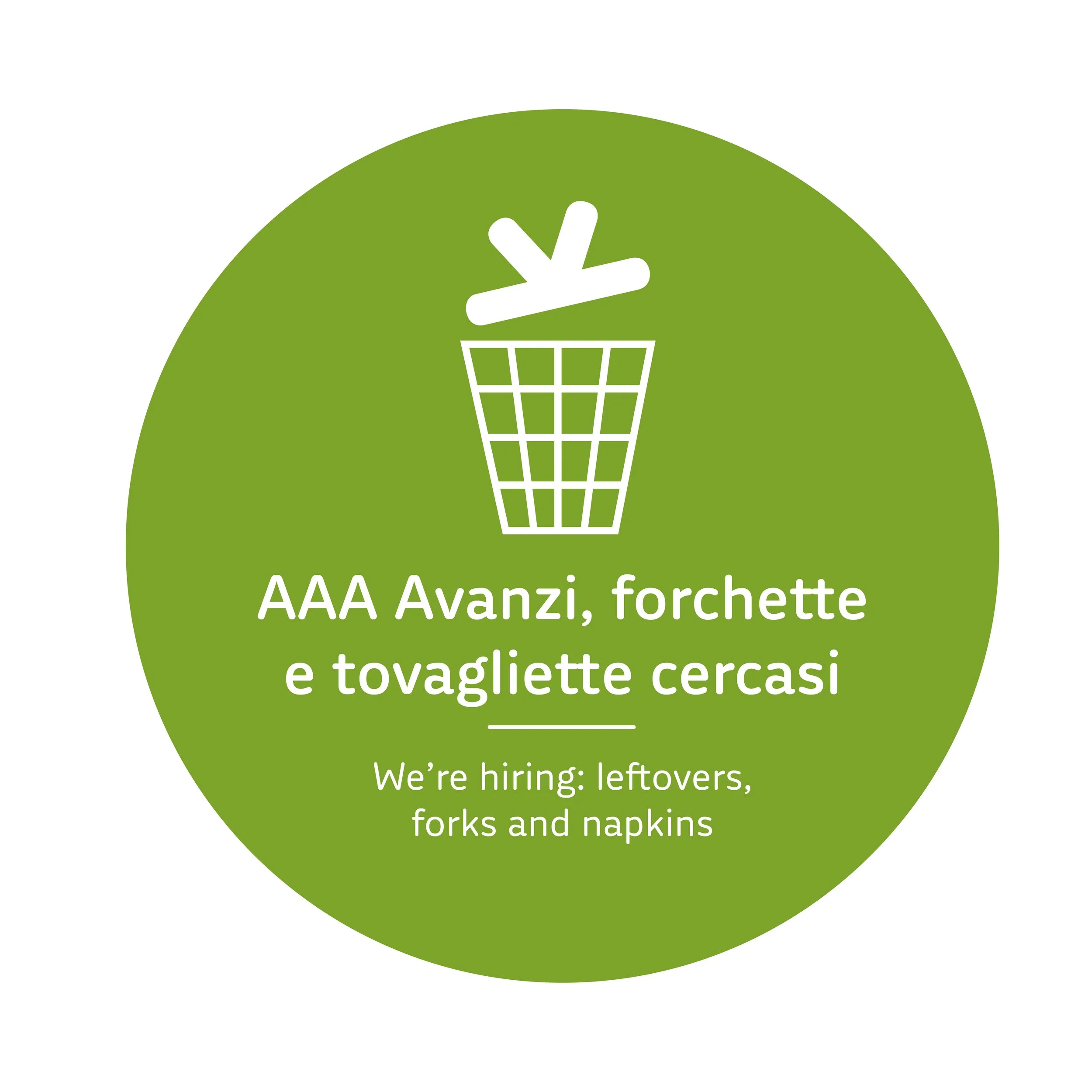
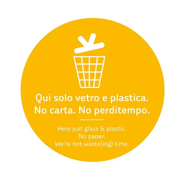
Bilingual, ironic and direct, it turns everyday moments into small brand messages: stickers on the bins read “AAA Avanzi, forchette e tovagliette cercasi” with the english translation “We’re hiring: leftovers, forks and napkins”, whereas “No carta. No perditempo.” plays on the idea of not wasting time. Badges with phrases such as “Sto imparando!” and “La pazienza è la virtù dei forti!” gives the same friendly attitude